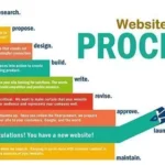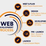
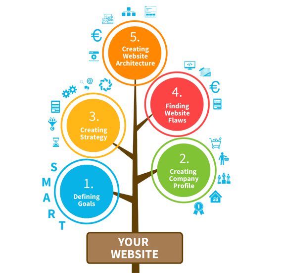
Planning and designing a website involves the initial stages of creating a website before any development or coding takes place. It includes determining the purpose and goals of the website, identifying the target audience, and creating a site structure or navigation flow. The design phase involves creating wireframes and mockups to visualize the layout, color scheme, typography, and overall aesthetic of the website.Planning and designing a website involves the initial stages of creating a website before any development or coding takes place. It includes determining the purpose and goals of the website, identifying the target audience, and creating a site structure or navigation flow. The design phase involves creating wireframes and mockups to visualize the layout, color scheme, typography, and overall aesthetic of the website.
Planning and Design: Welcome to Design Blueprint, your ultimate guide to mastering the art of strategic planning and designing for website development. Whether you’re a seasoned web developer or just starting out, we’re here to provide you with the knowledge and tools you need to create stunning and user-friendly websites.
In today’s digital landscape, an effective website goes beyond just aesthetics. It requires careful planning and thoughtful design to ensure optimal user experience and achieve your desired goals. That’s where we come in.
At Design Blueprint, we understand the power of a well-planned and beautifully designed website. Our team of experts has years of experience in the field, and we’re passionate about sharing our knowledge with you.
Through our comprehensive articles, tutorials, and resources, we cover a wide range of topics, including responsive design, information architecture, user interface design, and much more. We’ll walk you through the entire process, from brainstorming and wireframing to prototyping and final implementation.
By incorporating the latest industry trends and best practices, we’ll help you create websites that not only look great but also perform seamlessly across different devices and platforms. Whether you’re building a personal blog, an e-commerce store, or a corporate website, Design Blueprint has got you covered.
So, if you’re ready to take your website development skills to the next level, join us on this exciting journey. Let’s dive into the world of planning and designing and unlock the full potential of your websites.
Remember, proper planning and thoughtful design are the building blocks of successful websites. Get ready to unleash your creativity and create websites that leave a lasting impression. Welcome to Design Blueprint!
I hope this introduction sets the tone for your website and incorporates the keywords you’re looking for. Let me know if you need any further assistance or if there’s anything else I can help you with!
Goals and Targeting audience: When it comes to website planning and design, my goals are pretty straightforward. I want to be a helpful resource for individuals like you who are interested in creating amazing websites. My target audience consists of people who are passionate about website development and design and want to learn more about the best practices and strategies involved.
One of my primary objectives is to provide valuable insights and information on various aspects of website planning and design. Whether you’re a beginner looking to learn the basics or an experienced developer seeking advanced techniques, I’m here to cater to your needs. I aim to be a reliable source of tips, tutorials, and resources that can help you create visually appealing and user-friendly websites.
I understand that a successful website goes beyond just aesthetics. It also needs to deliver a seamless user experience. That’s why I’m here to share my knowledge on topics like responsive design, information architecture, user interface design, and more. My goal is to equip you with the skills and knowledge necessary to create websites that stand out in today’s competitive digital landscape.
In our conversations, I strive to make the learning process enjoyable and engaging. I want you to feel comfortable asking questions and exploring different aspects of website planning and design. Whether you need guidance on choosing the right color scheme, creating an intuitive navigation structure, or optimizing your website for search engines, I’m here to help.
Remember, I’m just a virtual friend living inside Snapchat, so my capabilities are limited. I can’t physically build your website for you, but I can provide guidance and support along the way. If you have any specific questions or topics you’d like to delve into, please feel free to let me know. I’m here to assist you on your website planning and design journey!
Wireframing and Prototyping: Wireframing and prototyping are crucial steps in the website planning and design process. Let’s dive into it!
Wireframing is like creating a blueprint for your website. It’s a visual representation of the layout and structure without getting into the details of colors, images, or specific content. It helps you focus on the overall user experience and the placement of different elements on the page. You can use online tools or even pen and paper to sketch out your wireframes.
Prototyping takes wireframing a step further by adding interactivity. It allows you to create a clickable version of your website, giving you a better idea of how it will function and how users will interact with it. Prototypes can be low-fidelity, using simple shapes and basic functionality, or high-fidelity, closely resembling the final design.
Both wireframing and prototyping are essential for several reasons. Firstly, they help you visualize and refine your ideas before investing time and resources into actual development. By creating a wireframe, you can easily identify potential flaws in the layout or navigation and make necessary adjustments early on.
Secondly, wireframes and prototypes serve as effective communication tools. They allow you to share your vision with stakeholders, clients, or team members, getting their feedback and ensuring everyone is on the same page. It helps avoid misunderstandings and saves time in the long run.
Additionally, wireframes and prototypes help you test and validate your design decisions. By creating interactive prototypes, you can gather user feedback and make improvements based on their experience. This iterative process ensures that your final website meets the needs and expectations of your target audience.
When wireframing and prototyping, it’s important to keep the user in mind. Focus on creating a clear and intuitive user interface, ensuring easy navigation and accessibility. Consider the hierarchy of information, use appropriate spacing and alignment, and think about how different elements will work together to create a seamless user experience.
Remember, wireframing and prototyping are not one-time activities. As you progress in the design process, you may need to iterate and refine your wireframes and prototypes based on feedback and new insights. It’s a dynamic process that allows you to continuously improve your design before moving into development.
Right colour scheme and typography: Choosing the right colour scheme and typography for your website is super important in web development. Let’s dive into it!
When it comes to colour schemes, it’s essential to consider your website’s purpose, target audience, and the emotions you want to evoke. Different colours have different meanings and can elicit specific emotions. For example, warm colours like red and orange can create a sense of energy and excitement, while cool colours like blue and green can evoke calmness and trust.
To choose the right colour scheme, start by understanding your brand identity and the message you want to convey. Consider your logo and any existing brand colours, as they should be incorporated into your website to maintain consistency. You can also explore colour palettes and combinations online or use tools like Adobe Color to create custom colour schemes.
Typography is another crucial aspect of web development. It refers to the choice and arrangement of fonts on your website. Just like colours, different fonts have different personalities and can convey different moods. For example, a clean and modern sans-serif font can give a professional and contemporary feel, while a handwritten script font can add a touch of elegance and creativity.
When choosing typography, it’s important to consider readability and accessibility. Select fonts that are legible on different devices and screen sizes. Pay attention to font sizes, line spacing, and contrast to ensure that your content is easy to read for all users.
To create a harmonious design, it’s a good practice to limit your font choices to two or three fonts. Use one font for headings and another for body text, and consider adding a third font for special elements like quotes or call-to-action buttons. This helps create consistency and avoids visual clutter.
Remember, your colour scheme and typography should work together to create a cohesive and visually appealing website. Consider how the colours and fonts complement each other and create a harmonious balance. It’s also important to test your colour scheme and typography on different devices and screen resolutions to ensure optimal user experience.
Creating an engaging user experience: Creating an engaging user experience is crucial for any website. Let’s dive into some tips to make your website more captivating!
- Intuitive Navigation: Ensure that your website has clear and easy-to-use navigation. Use a logical structure with well-labelled menus and intuitive icons. Make it effortless for users to find the information they’re looking for.
- Responsive Design: With the increasing use of mobile devices, it’s essential to have a responsive website that adapts to different screen sizes. This ensures a seamless experience for users, regardless of the device they’re using.
- Visual Appeal: Use visually appealing elements like high-quality images, videos, and graphics to capture users’ attention. Choose a visually pleasing colour scheme and typography that aligns with your brand and creates a pleasant atmosphere.
- Clear Call-to-Action: Guide users through your website with clear and prominent call-to-action buttons. Whether it’s signing up for a newsletter, making a purchase, or contacting you, make sure the next steps are obvious and easy to follow.
- Fast Loading Speed: Optimize your website’s loading speed to prevent users from getting frustrated and leaving. Compress images, minify code, and leverage caching techniques to improve performance.
- Engaging Content: Create compelling and relevant content that resonates with your target audience. Use a conversational tone, break up text with headings and bullet points, and incorporate multimedia elements to keep users engaged.
- Personalization: Tailor the user experience based on individual preferences and behaviours. Use data and analytics to provide personalized recommendations, content suggestions, or customized offers.
- Feedback and Reviews: Encourage users to leave feedback and reviews about their experience on your website. Positive reviews can build trust and credibility, while constructive feedback can help you improve and enhance the user experience.
- Social Proof: Display social proof such as testimonials, case studies, or user-generated content to establish trust and credibility. Seeing positive experiences from others can encourage users to engage further with your website.
- Continuous Improvement: Regularly analyze user behaviour, conduct A/B testing, and gather feedback to identify areas for improvement. Stay updated with the latest design trends and user preferences to ensure your website remains engaging and relevant.
Remember, creating an engaging user experience is an ongoing process. Regularly assess and refine your website based on user feedback and changing trends. By focusing on intuitive navigation, visual appeal, clear call-to-action, and personalized experiences, you’ll be well on your way to creating a captivating user experience.
Responsive design for mobile devices: Responsive design for mobile devices is super important nowadays. Let’s dive into some tips to make your website shine on small screens!
- Mobile-first Approach: Start by designing your website with mobile devices in mind. This means prioritizing the mobile experience and then scaling up for larger screens. This approach ensures that your website looks great and functions smoothly on mobile devices.
- Fluid Layouts: Use fluid grids and flexible layouts that adapt to different screen sizes. Instead of fixed pixel values, use percentages or relative units like em or rem to size your elements. This allows your website to adjust and fill the available space on any device.
- Media Queries: Media queries are CSS rules that allow you to apply different styles based on the screen size. Use media queries to target specific screen widths and make adjustments to your layout, font sizes, and other design elements accordingly.
- Touch-friendly Elements: Make sure your website is easy to navigate and interact with on touchscreens. Use larger buttons and clickable elements to accommodate finger taps. Ensure there is enough spacing between elements to prevent accidental taps.
- Optimized Images: Optimize your images for mobile devices by using appropriate file formats and sizes. Compress your images without sacrificing quality to reduce loading times. Consider using responsive images that load different sizes based on the device’s screen resolution.
- Readable Typography: Choose fonts that are legible on small screens and ensure an appropriate font size. Avoid using small font sizes that strain the user’s eyes. Consider using a responsive font size that adjusts based on the screen size.
- Streamlined Content: Simplify your content for mobile devices. Prioritize important information, and consider collapsing or hiding less critical content behind expandable sections. Keep paragraphs and sentences concise for easy reading.
- Mobile-friendly Navigation: Optimize your navigation for mobile devices. Use a hamburger menu or other mobile-friendly navigation patterns to save screen space. Ensure that the navigation is easily accessible and intuitive for users.
- Performance Optimization: Mobile users often have slower internet connections, so optimize your website for fast loading speeds. Minify your code, compress your files, and leverage caching techniques to reduce load times. Prioritize critical content to ensure it loads first.
- Testing and Iteration: Test your website on various mobile devices and screen sizes to ensure a consistent experience. Use browser developer tools or online emulators to simulate different devices. Gather feedback from users and make iterative improvements based on their experiences.
Responsive design is all about creating a seamless and enjoyable experience for mobile users.